
Neutral rugs and earth-tone colorways now define the direction of luxury residential design with a consistency that would have seemed remarkable even a decade ago. Walk through any significant design fair, open any shelter magazine, scroll through the portfolios of the world's leading interior designers, and you will find the same visual language repeated with striking coherence: warm whites, sand, caramel, clay, latte, stone. The dominance of these earth tones in fine interiors is not a trend in the ordinary sense. It is the emergence of a considered, lasting aesthetic vocabulary — one that neutral rugs anchor with particular authority.
Understanding why this palette works, and how to use it with precision rather than simply repeating what everyone else is doing, is the difference between an interior that feels timelessly calm and one that simply feels beige.
Why Neutrals Dominate Luxury Design
The rise of the neutral palette in luxury interiors reflects a broader cultural shift away from maximalism and toward what might be called considered restraint. After decades of design driven by contrast, color drama, and visual complexity, the most sophisticated contemporary interiors have moved toward compositions that reward sustained attention rather than immediate impact.
A neutral room is not a simple room. It is a room in which every material, every texture, every proportion must be perfect — because there is nowhere to hide. When the palette is pared back, the quality of individual objects becomes the entire argument. A cashmere rug in the right caramel tone, in the right size, with the right pile depth, can carry an entire room. A beige synthetic carpet in the same room is immediately, irredeemably obvious as a failure of nerve.
This is precisely why earth-tone neutrals have become the preferred territory of genuinely high-end residential design. They demand quality, and they reward it handsomely.
The Earth Tone Palette: Understanding What You Are Working With
Earth tones in rug design span a range that is wider than it first appears. Within the family of neutrals, there are meaningful distinctions that significantly affect how a rug reads in a specific room.
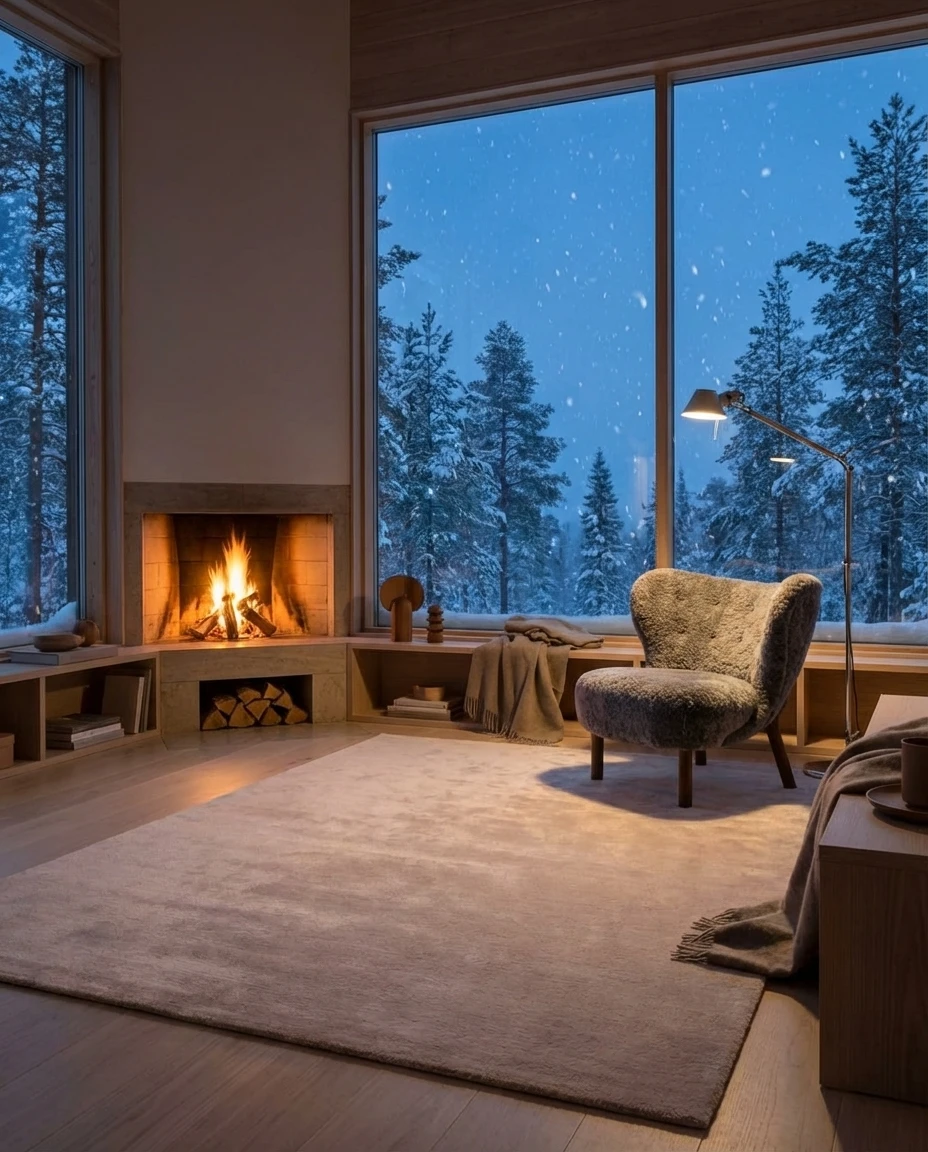
Sand and pale stone are the lightest end of the earth tone spectrum — warm whites that retain enough color to feel alive rather than clinical. These work beautifully in rooms with significant natural light, where they catch the shifting quality of sun through the day. They pair naturally with raw linen, bleached wood, and matte white plaster. Kapetto's Sabi Natural jute rug occupies this end of the palette, bringing an organic quality that no synthetic can approximate.
Latte and oat move slightly deeper into the warm range — creamy, enveloping tones that read as definitively warm without becoming dark. They are among the most versatile of the earth tones, pairing easily with both warm wood tones and cooler marble or stone surfaces. Our Cashmere Latte sits here: soft enough to recede, warm enough to anchor.
Caramel and amber are the richest of the standard earth tones, bringing genuine color warmth without leaving the neutral family. A caramel rug will warm a north-facing room, counteract the cool cast of grey stone, and add a sense of generous depth to large open-plan spaces. Kapetto's Cashmere Caramel and Nami Caramel wool rug both occupy this territory, each with the particular quality of warmth that comes from natural dye on natural fiber.
Clay, terracotta, and rust push further toward color while retaining the earthy, grounded quality of the palette. These work best as accents or as the dominant element in a room built entirely around warm tones — think white plaster, natural linen, and a single clay rug as the only real color in the composition.
Warm vs. Cool Neutrals: The Critical Distinction
The single most common mistake in neutral room design is mixing warm and cool neutrals without conscious intent. A warm caramel rug against a cool grey sofa will look accidentally mismatched rather than deliberately varied. A warm white rug against a warm stone wall and warm wood furniture will read as a unified, considered composition.
Determine the underlying temperature of your room before selecting a rug. Look at the floor finish: warm wood floors call for warm-toned rugs; cool concrete or stone can go either way but tends to benefit from warm rugs that counteract the chill of hard surfaces. Look at your largest upholstered pieces: the fabric on a major sofa is usually the dominant warm or cool signal in a room, and the rug should generally harmonize rather than contrast with it.
In practice, Kapetto's caramel and latte colorways are reliably warm — they contain yellow and red undertones rather than blue or grey ones. This makes them compatible with most warm-floored residential spaces, with natural oak, with walnut, with most linen and cotton upholstery in the cream-to-oat range.
The best neutral rooms are not rooms without color. They are rooms in which every surface, every material, every textile contributes its own subtle temperature — and all of those temperatures agree.
Pairing Neutral Rugs with Furniture and Walls
A neutral rug is not a background. It is a foundation, and the relationship between the rug and the other surfaces in the room determines whether the composition reads as effortless or as absent.
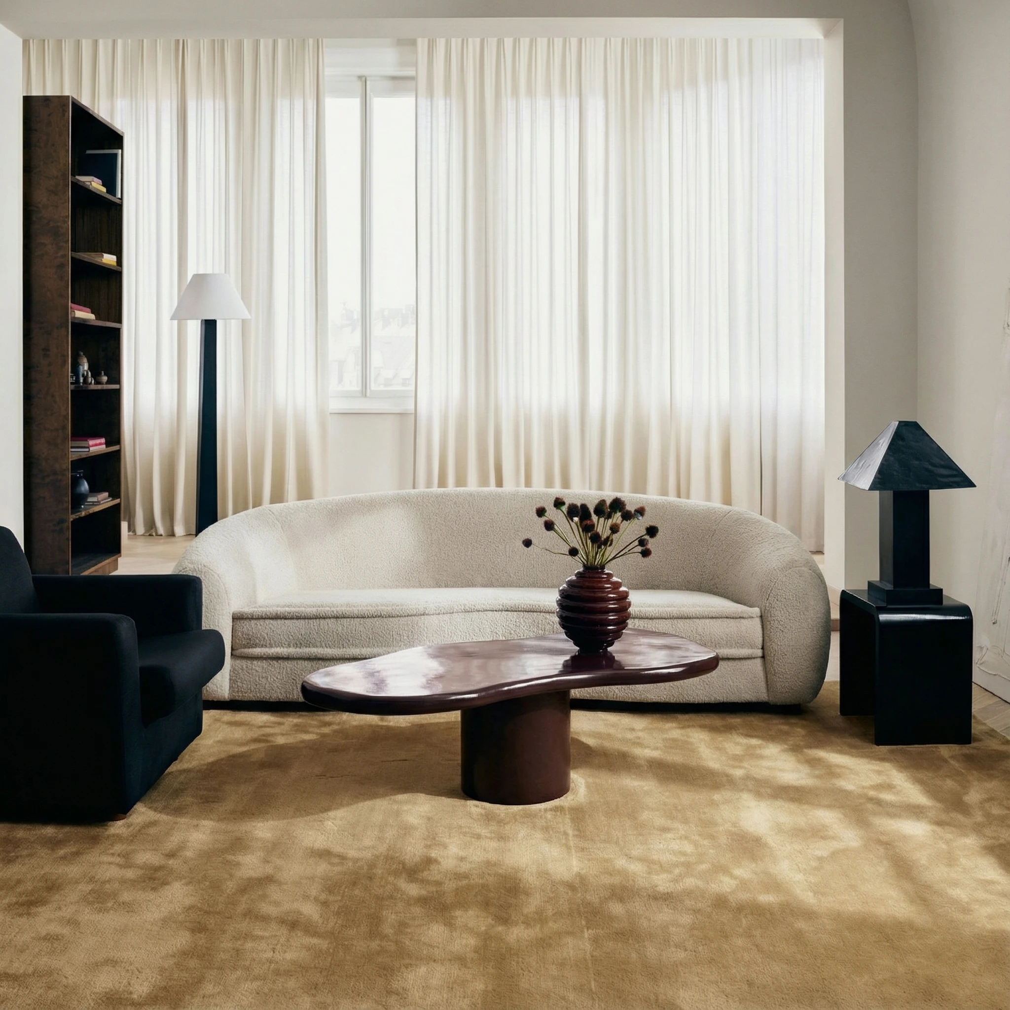
With white walls. Warm white walls and a caramel or latte rug create a quiet, luminous effect that reads as genuinely sophisticated. Add texture through upholstery (linen, boucle, natural cotton) and one or two objects in a material with visual weight (a terracotta vessel, a dark wood table) to prevent the room from feeling undercomposed. Avoid cool white walls with warm rugs — the undertone clash will be visible and unresolved.
With warm-toned wood. Honey oak, blonde wood, and walnut all pair naturally with earth-tone rugs. The key is to vary the values rather than matching them: a mid-caramel rug with a lighter oak floor and a slightly darker walnut coffee table creates movement within the warm palette without introducing a disruptive contrast. Matching wood and rug tones exactly produces a flat, uninteresting effect.
With stone and marble. Cream marble and warm limestone floors benefit enormously from a warm-toned rug. The rug prevents the floor from feeling cold and adds the kind of tactile contrast that makes a material-forward room feel considered. A cashmere or high-pile wool rug against a hard stone floor is one of the most satisfying textural juxtapositions in residential design.
Layering Textures in a Neutral Room
When color is restrained, texture becomes the primary expressive tool. A room that uses a consistent earth-tone palette but varies texture dramatically — a smooth plaster wall, a loosely woven linen sofa, a tightly knotted cashmere rug, a rough-cut stone object — will feel alive and generous. A room with the same palette but a single texture will feel flat and fatiguing.
The rug's texture is especially important in this context, because it occupies such a large area of the room and is experienced both visually and physically. A cashmere pile rug brings a quality of softness that no other surface in the room will have — this is the point of contrast that makes the room feel complete. A flat-weave jute rug in the same neutral palette will read entirely differently, its graphic surface structure providing visual interest through pattern rather than depth.
Consider layering rugs themselves when the room allows it. A flat-weave jute rug as a base layer, with a smaller cashmere or wool rug centered over it, creates a composed, intentional effect that references global design traditions while serving a very contemporary aesthetic. The Sabi jute and Cashmere Caramel work particularly well as a layered pair — the organic surface of the jute contrasting beautifully with the fine pile of the cashmere.
Size and Proportion in Neutral Rooms
In a neutral room, an undersized rug is conspicuously wrong. Because there is no color drama to create visual separation between zones, the rug must do the spatial work of defining the seating or dining area through its actual physical presence. Err on the side of generosity: in a living room, all primary seating pieces should have at least their front legs on the rug. In a dining room, the rug should extend at least 24 inches beyond the table on all sides.
For rooms that will receive a neutral rug, a 9-by-12 foot piece is often the minimum for a primary living space. The scale allows the rug to read as a genuine design decision rather than an afterthought. Kapetto offers all collections in 9-by-12 as a standard size, with custom sizing available for projects that require something outside standard dimensions.
Kapetto's Earth Tone Colorways
Our palette at Kapetto has been developed specifically for the warm, sophisticated neutral interiors that define contemporary luxury residential design. Every colorway — Caramel, Latte, Nami Caramel, and Sabi Natural — is produced using natural dyes on natural fibers, which gives these colors a depth and variation that synthetic dyeing on synthetic fiber cannot replicate. The color lives in the material rather than sitting on its surface.
For trade professionals working on projects that require custom colorways or non-standard sizes, our trade program provides access to the full range of sampling and customization options. For personal projects, our full collections in cashmere, wool, and jute are available directly through the Kapetto website.
The earth tone palette rewards commitment. When every surface in a room is chosen with the same attention to warmth, texture, and material honesty, the result is an interior that feels not merely beautiful but genuinely right — as though it could not have been any other way.

