
Ask any experienced interior designer what the single most transformative element in a room is, and a significant number will say the rug. Not the sofa, not the lighting, not the art on the walls. The rug. Understanding how designers choose rugs — and why those choices carry such weight — is the key to using them with the same intentionality in your own work. Rugs in interior design are not decorative afterthoughts. They are structural decisions.
This is how the best designers think about them.
Zoning Open-Plan Spaces
The open-plan floor plan — kitchen flowing into dining flowing into living — is one of the defining features of contemporary residential design, and one of its greatest spatial challenges. Without walls to define where one area ends and another begins, the eye struggles to find hierarchy. A beautifully furnished room can read as chaotic simply because there is no visual logic to how the zones relate.
Rugs solve this problem elegantly. A large-format rug placed beneath a seating group creates an immediate room-within-a-room effect. The rug's perimeter becomes a soft boundary, telling the eye where the conversation zone lives. A different rug under the dining table creates a second zone with a different character — perhaps more textured, perhaps in a complementary but distinct tone.
The critical rule for zoning with rugs: the rug must be large enough to contain the furniture group it anchors. A rug that is too small leaves furniture floating at its edges, which undermines the zoning effect entirely. In living rooms, the standard guidance is to ensure that all primary seating pieces have at least their front legs on the rug. In practice, this means that most designers working with standard living room arrangements will need a minimum 8x10, and more often a 9x12.
Color Anchoring: How a Rug Sets the Palette
Color theory in interior design often works from the ground up, and for good reason. The floor is one of the largest continuous surfaces in any room, and its color temperature sets the baseline for everything placed above it. A warm-toned rug will pull the eye toward the warm notes in upholstery, drapery, and accessories, creating a sense of cohesion even when those individual elements were not deliberately matched. A cool-toned rug does the opposite — it cools the room's overall register and makes even warm accents read as more controlled.
Experienced designers use rugs as the anchor point from which the entire color palette radiates. They will select the rug before the upholstery fabric, before the wall color, and sometimes before the furniture itself. This sequencing reflects a practical truth: it is far easier to find a sofa that works with a specific rug than to find a rug that works with a specific sofa.
Kapetto's palette has been developed with this sequencing approach in mind. The warm ivory of Cashmere Latte, the golden caramel of Nami, the soft natural of Sabi — these tones are calibrated to function as ground colors that give surrounding elements room to breathe. They do not compete. They invite.
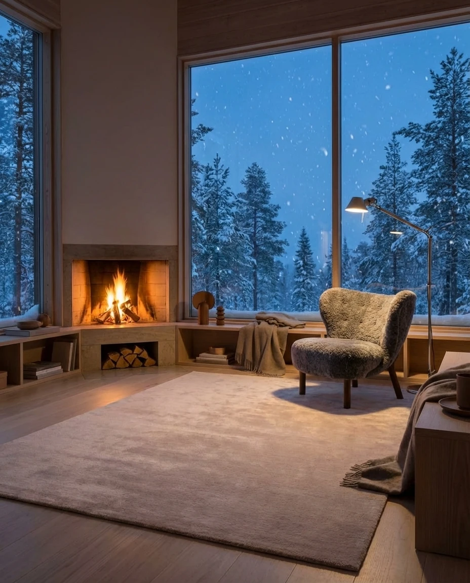
Texture Layering: The Tactile Dimension of a Room
A room that is visually sophisticated but texturally flat will always feel slightly off, though clients often cannot articulate exactly why. The answer is usually that every surface has a similar visual weight — perhaps everything is smooth, or everything is matte, or every material has roughly the same density of surface interest. The eye craves variation in texture the same way it craves variation in color, and the rug is often the primary vehicle for introducing that variation.
In a room furnished with smooth velvet sofas, lacquered tables, and polished stone floors, a deeply piled cashmere rug introduces a soft counterpoint that makes everything else read more crisply. The contrast between the rug's warmth and the room's harder surfaces creates a tension that feels resolved rather than unfinished — the equivalent of a soft note in an otherwise architectural composition.
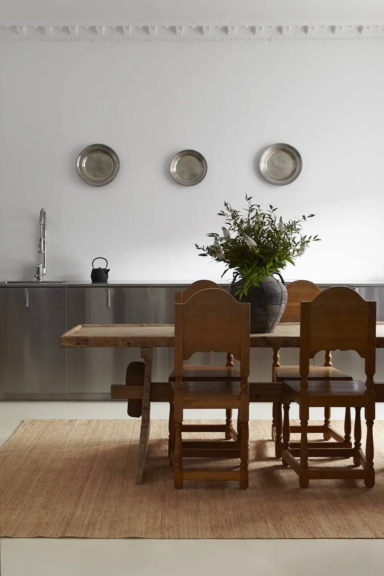
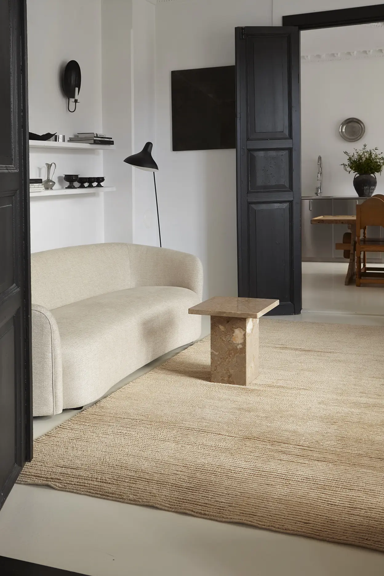
Texture layering also works well when two rugs are used in proximity. A flat-weave jute like Kapetto's Sabi under a dining table, paired with a deeply piled cashmere in the adjacent living zone, creates a textural narrative that moves from utilitarian to luxurious as you move through the space. This is a technique that designers working on large open-plan residences use frequently.
Scale and Proportion: The Most Common Mistake
If there is a single mistake that separates amateur rug placement from professional rug placement, it is scale. Specifically, the tendency to choose a rug that is too small. A rug that is correctly scaled feels inevitable in a room. A rug that is too small makes the furniture above it look stranded, and makes the room feel smaller than it actually is.
Designers use a straightforward test: tape out the proposed rug dimensions on the floor before ordering. This takes fifteen minutes and eliminates the most common and most expensive rug mistake. It reveals whether the proposed size will adequately contain the furniture group, whether it will leave an appropriate margin of bare floor at the room's perimeter, and whether the room's proportions call for a more square format or a more rectangular one.
The margin of bare floor matters as much as the rug itself. Most designers aim for 18 to 24 inches of bare floor between the rug's edge and the baseboard — enough to visually frame the rug and allow the floor material to participate in the room's composition. In very large rooms, this margin can expand to 36 inches without feeling awkward. What does not work is a rug that runs to within inches of the wall, making the room feel smaller, or a rug so small it seems to have been placed randomly in the middle of the floor.
Designer Case Studies: Kapetto in Real Projects
The principles above are easier to understand when they are grounded in specific projects. The following are drawn from Kapetto's portfolio of completed installations, visible in the Projects section.
California Residence: Zoning a 1,400-Square-Foot Open Plan

The designer on this Los Angeles project used three Kapetto rugs to parse a 1,400-square-foot open-plan ground floor into clearly legible zones without introducing any physical partitions. The Cashmere Latte in 9x12 anchored the primary living group. A Nami Caramel in 6x9 defined a reading alcove off the main seating area. Sabi Natural in 5x7 marked the entry transition from the hardscape outside. Each rug shares a warm neutral palette but differs in texture — a deliberate choice that gives each zone its own tactile character while maintaining chromatic cohesion.
Hamptons Beach House: Color as Structural Decision
A Hamptons renovation project began with the rug. The designer chose a Cashmere Caramel before selecting any other element, using its warm golden tone as the chromatic key from which all other palette decisions were made. Linen drapery was matched to its lighter register. Upholstery was drawn from its mid-tone. Wall color was selected from its cooler underlying notes. The result is a room where every element feels in conversation with the others — a cohesion that came from starting at the ground and working upward.
Scandinavian Apartment: Textural Counterpoint

In a Stockholm apartment where the designer had deliberately committed to concrete, glass, and brushed metal throughout, the rug was understood from the beginning as the room's warmth source. Kapetto's Kiri hand-knotted in wool was chosen specifically for its dense, deeply textured pile — a surface that provided not just visual warmth but a tactile invitation to enter and remain in the space. Without it, the room would have felt correct but inhospitable. With it, the hard surfaces read as intentional rather than cold.
Working with a Designer Trade Account
Interior designers working on projects that require the level of intentionality described above benefit from direct access to Kapetto's extended product specifications, custom sizing capabilities, and project support. The Kapetto Trade Program offers qualified designers preferred pricing, sample access, and dedicated support for custom commissions. Visit the trade page to apply or to request more information about specifying Kapetto for your next project.
Explore the full collection: Cashmere, Wool, Jute. Each collection includes detailed product specifications, material sourcing information, and available size ranges.

